Receiver Operating Characteristic (ROC)
For classification tasks, Receiver Operating Characteristic (ROC) curve and Area Under Curve (AUC) are important concepts to know. At times, I have seen people unclear about these concepts and hence my effort to explain these.
Why is this important?
Imagine a dataset repesenting 2 classes but highly skewed, say 90%-10% for positive-negative labels. On such dataset, even a “always-positive” classifier could be 90% accurate.
- How do we evaluate or rank various classifiers performance on such dataset?
Now imagine a multi-class dataset with 100 classes, and there are few classes which makeup up <1% in this set.
There may be classifiers which probably have lower accuracy than others but may do a good job in correctly classifying such hard examples.
- Would you prefer those?
- How would you trade-off accuracy VS correct-prediction of some of these rare classes.
Answering these questions require some interpretation of how well a classifier has separated different classes.
Receiver Operating Characteristic basics.
(For purpose of illustrations, I will mainly assume that classifier learns a gaussian distribution for classes, although following analysis can be extended to any distribution. A Gaussian (or Normal) Probability Density Function =
Wikipedia describes ROC as: “In statistics, a receiver operating characteristic curve, i.e. ROC curve, is a graphical plot that illustrates the diagnostic ability of a binary classifier system as its discrimination threshold is varied.”
Discrimination threshold is also sometimes called the Decision Boundary, the meaning of which is explained below.
To understand ROC, let us first build on few even more basic concepts.
- True Positive
- False Negative
- False Positive
- True Negative
Consider 2 Gaussian Distributions learned by our classifier
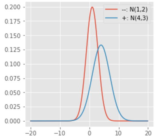
Here, the Blue curve is distribution of ‘Positive (or +ve)’ examples learnt by our classifier (so Red is ‘Negative (or -ve)’ distribution learnt).
Let us say, we set the Decision Boundary (DB)=0.0. That is, if output of classifier is<DB, it will be classified -ve, otherwise +ve.
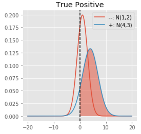
Shaded area under the curve above represents chance that an example belongs to +ve class (Blue curve) and is classified correctly (right to Decision Boundary). This is called True Positive (TP).
Shaded area can be calculated as:
(here=0.91 that is, 91% actual positive examples are classified correctly. :-))
It is not hard to understand that Area under Blue curve on the other side of Decision Boundary would be called False Negative, as it is classified -ve (left of decision boundary) but actually belongs to +ve class.
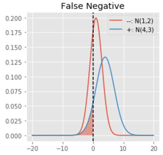
This is simply, FN=1-TP
(here=0.09, that is, only 9% of actual positive examples are classified incorrectly. Still :-))
So far so good. Does -ve class distribution (Red curve) learnt by our classifier has any effect?
Shaded area under the curve below represents chance that the example belongs to -ve class (Red curve) and is classified incorrectly (right to Decision Boundary). This is called False Positive (FP).
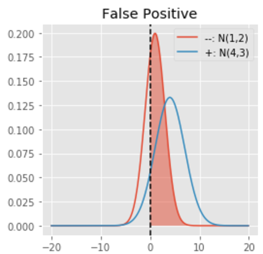
It can be calculated similar to TP but applied on Red curve now.
(here=0.69. WOW, too many -ve examples classified as +ve. That doesn’t sound good :-()
Further shaded area under the curve below represents chance that the example belongs to -ve class (Red curve) and is classified correctly (left to Decision Boundary). This is called True Negative (TN).
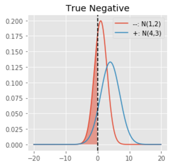
Its value can be calculated similar to FN.
(here=0.31. So -ve classe is not learnt as well as +ve :-()
Having defined TP, FN, FP and TN, we can visualize their relationship in a tabular format.

In order to measure how relevant the predictions of our classifier are, we further calculate Precision and Recall as defined below:
Basically:
Precision measures how many relevant +ve examples (TP) are retreived among total retreived +ve examples (TP+FP)
Recall measures how many relevant +ve example (TP) are retreived among total relevant +ve examples (TP+FN)
I will explain Precision and Recall curves in another post.
Now we are ready to delve further into ROC.
An ROC curve is mainly constructed using TP and FP while varying decision boundary.
It makes sense to consider TP and FP as together they give us an idea about overlap between relevant and retreived examples.
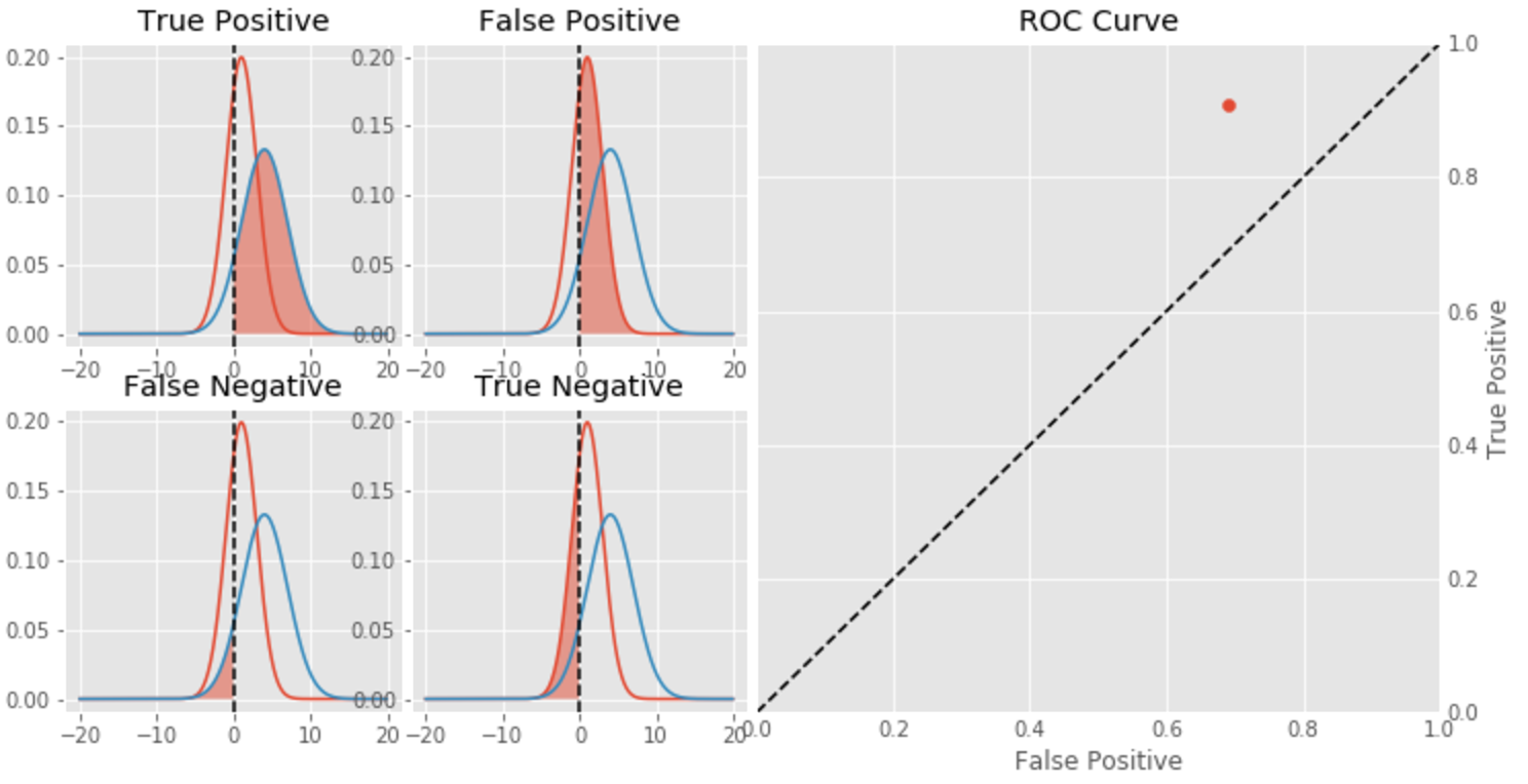
So far we have assumed Decision Boundary (DB)=0.0. With this, we saw TP=0.91 but FP=0.69.
ROC point corresponding to these values would look like:
What happens when DB is moved towards + by +3?
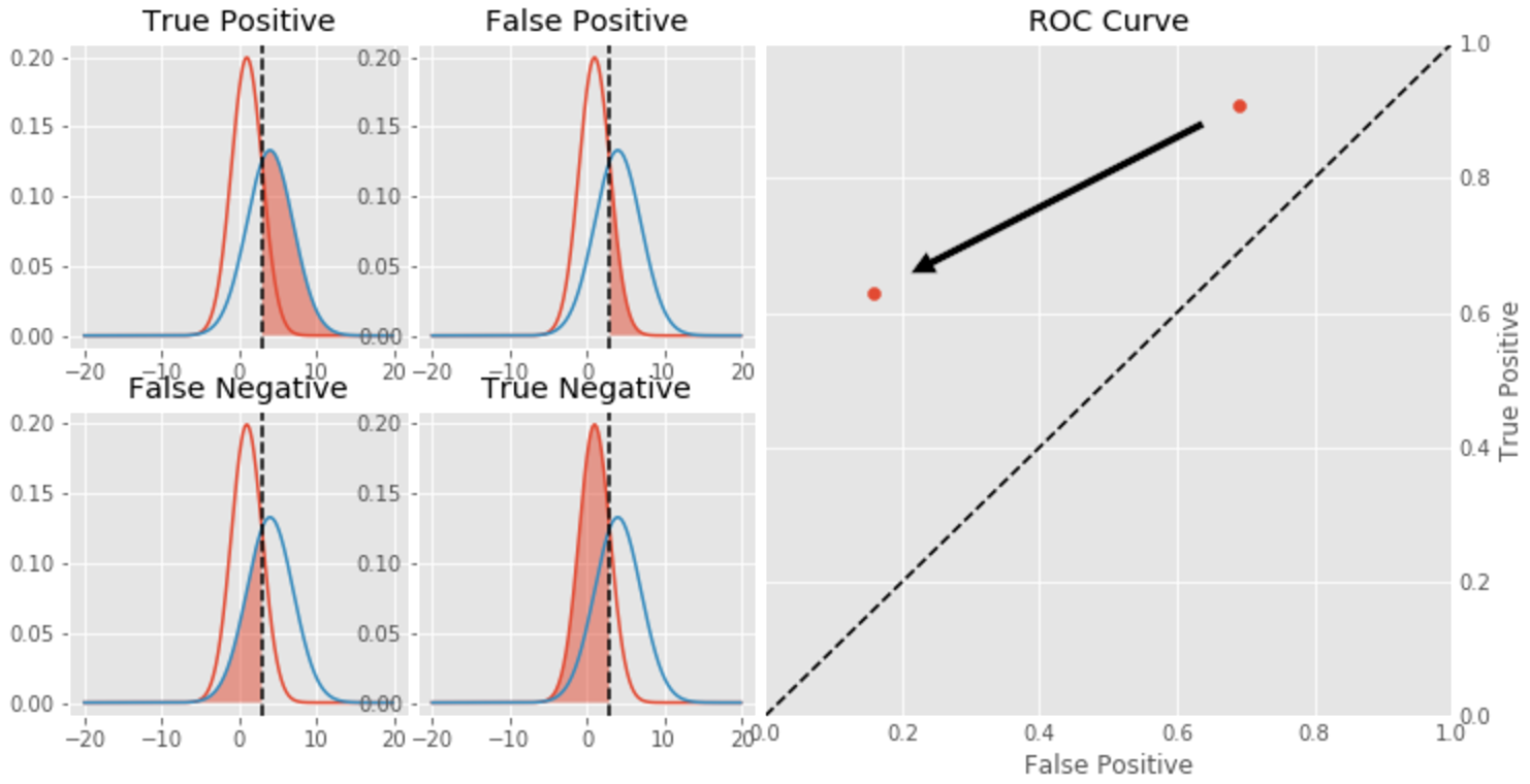
Putting it all together…
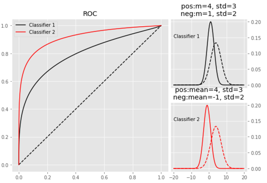
Now consider 2 classifiers “Classifier 1” and “Classifier 2”.
“Classifier 2” separates classes better. So how do ROC curves look like?

Clearly “Classifier 2” is better and ROC curve fully captures this property.
Basically Area Under ROC Curve (AUC) of “Classifier 2” > that of “Classifier 1”.
Conclusion
We saw to construct ROC curves and how to interpret the results.
We also saw that ROC curve fully captures goodness of a classifier.
A “always-positive” classifier on a very skewed dataset (90-10% positive-negative) may fool us onto believing it works well, but its ROC curve will be very close to x=y line
Source code for generating plots